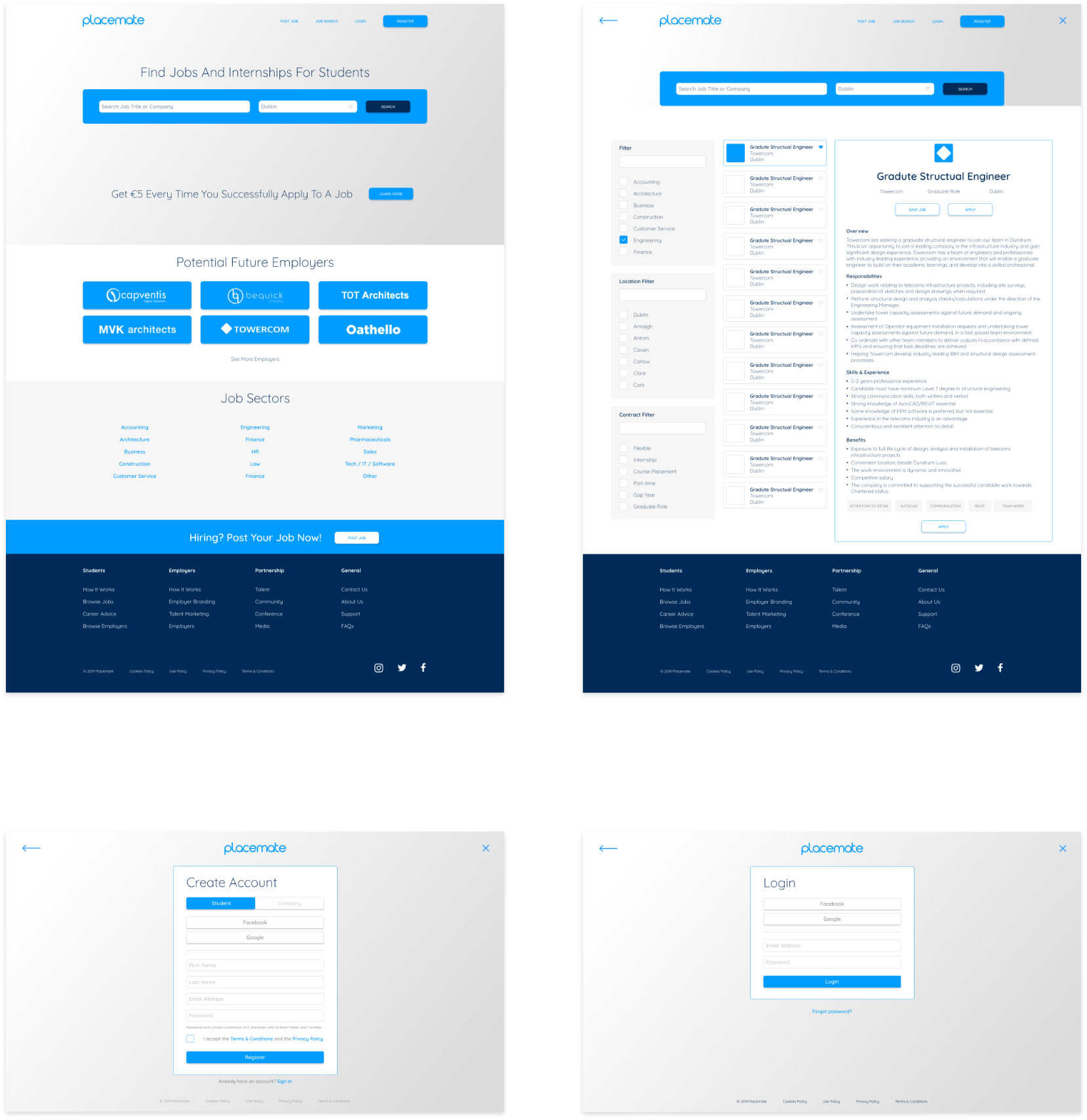
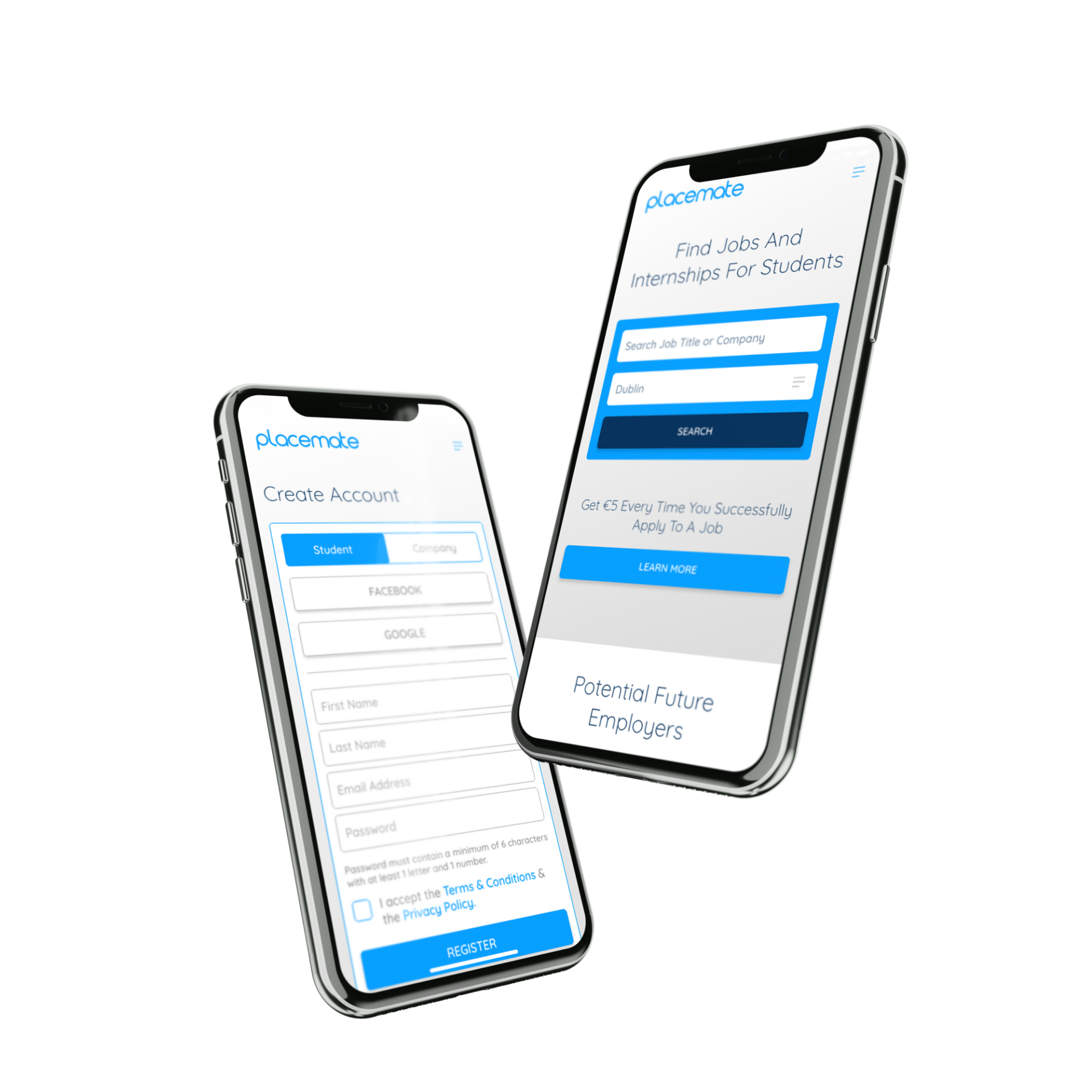
Conclusion
What was uncovered when I tested the existing site was consistent with what the client had already informed me, that users where experiencing issues and were continually failing to achieve their goals.
Ultimately, along the user journey the users were getting frustrated. What the user testing managed to do was pinpoint the exact location users lost their patience.
After a brief questionnaire, followed by some open conversation, I was able to understand what the users expected from the site and how basic affordances weren’t being applied.
The project was a great example of how, as designers we need to encourage our clients, to understand that when it come to designing any user interface, it's imperative that we keep it simple.