An Post set out to expand its Money product offering by creating a unified mobile app that would serve both existing Current Account customers and a new Youth Account for users aged 10–15. The goal was to deliver a mobile-first digital experience that was intuitive, secure, and age-appropriate, while also ensuring a seamless transition across desktop touchpoints. My role involved leading the UX/UI approach, shaping the experience strategy, and aligning multiple stakeholder groups to deliver a cohesive, scalable solution.
Problem
The challenge was twofold:
Unify disparate customer journeys for both adult and youth users under a single product ecosystem — without compromising clarity, compliance, or security.
Design an engaging and trusted experience for younger users that felt expressive and approachable while still adhering to regulatory constraints and parental oversight expectations.
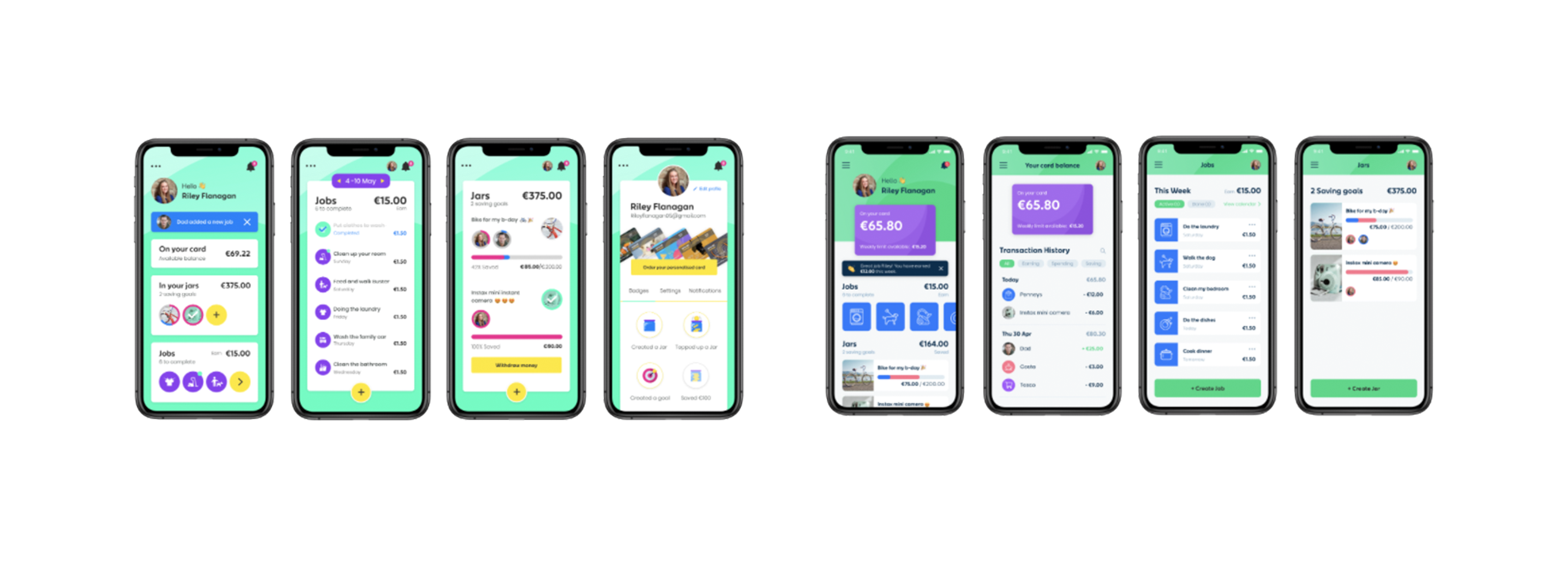
The experience needed to balance financial empowerment with responsible guidance, ensuring that young account holders could learn, explore, and manage money with confidence, while parents retained clear visibility and control.
Process
We adopted an iterative, research-led design process to validate assumptions, understand user needs, and refine the experience:
User & Behavioural Research
Working with SPARK Market Research, we gathered insight into how young users interact with digital products, what motivates them, and what influences trust and autonomy. This research shaped our tone of voice, visual choices, and feature prioritisation.
Market & Competitive Analysis
We benchmarked leading youth-focused financial and lifestyle apps to understand visual language, interaction patterns, and engagement techniques that resonated with the demographic. This ensured our UX direction was relatable, accessible, and age-appropriate without feeling childish.
Design Exploration & Rapid Prototyping
The design team developed multiple visual and interaction concepts to explore palette, layout, illustration style, and motion cues. These early prototypes were tested with stakeholders and representative users to gather feedback on clarity, appeal, and usability.
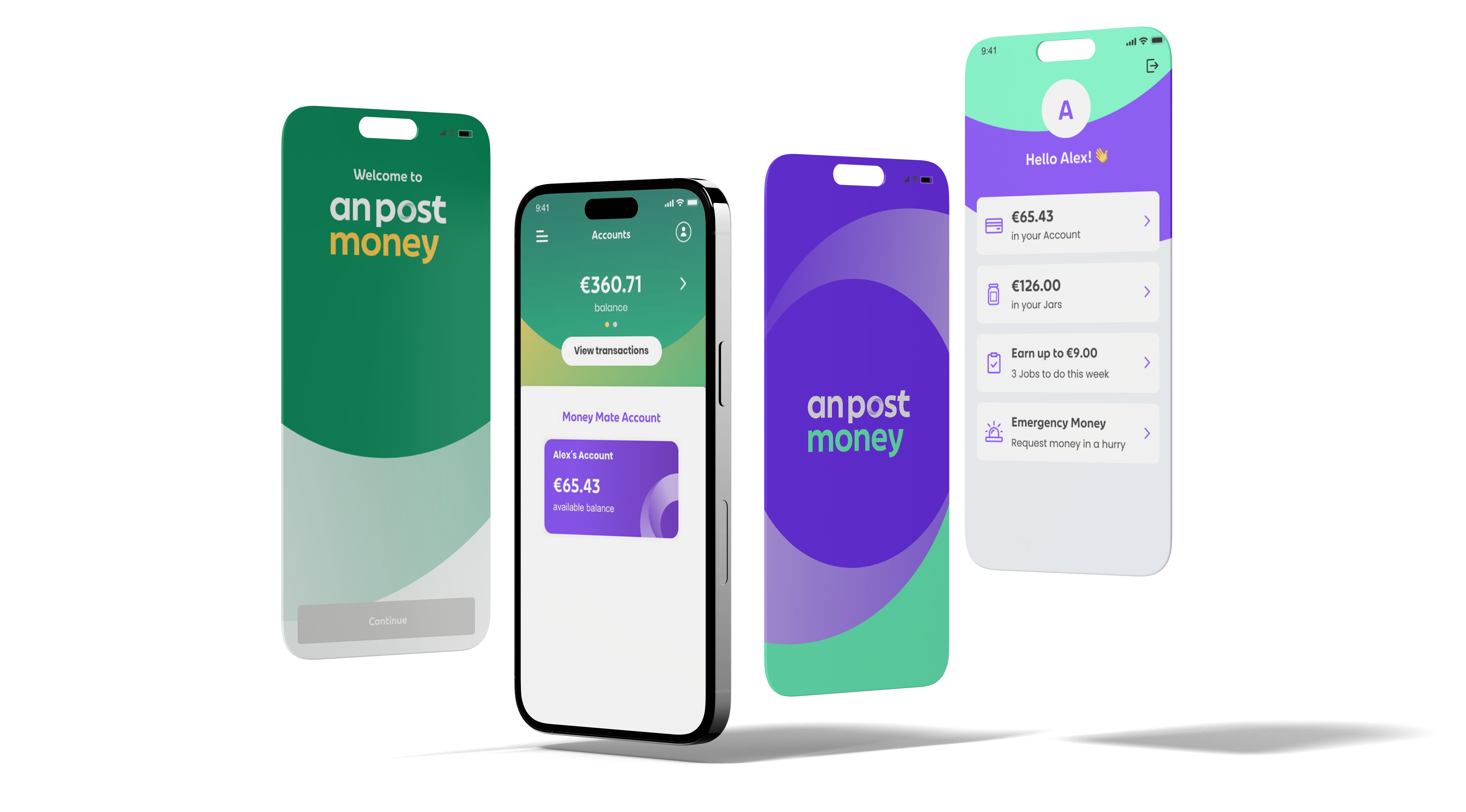
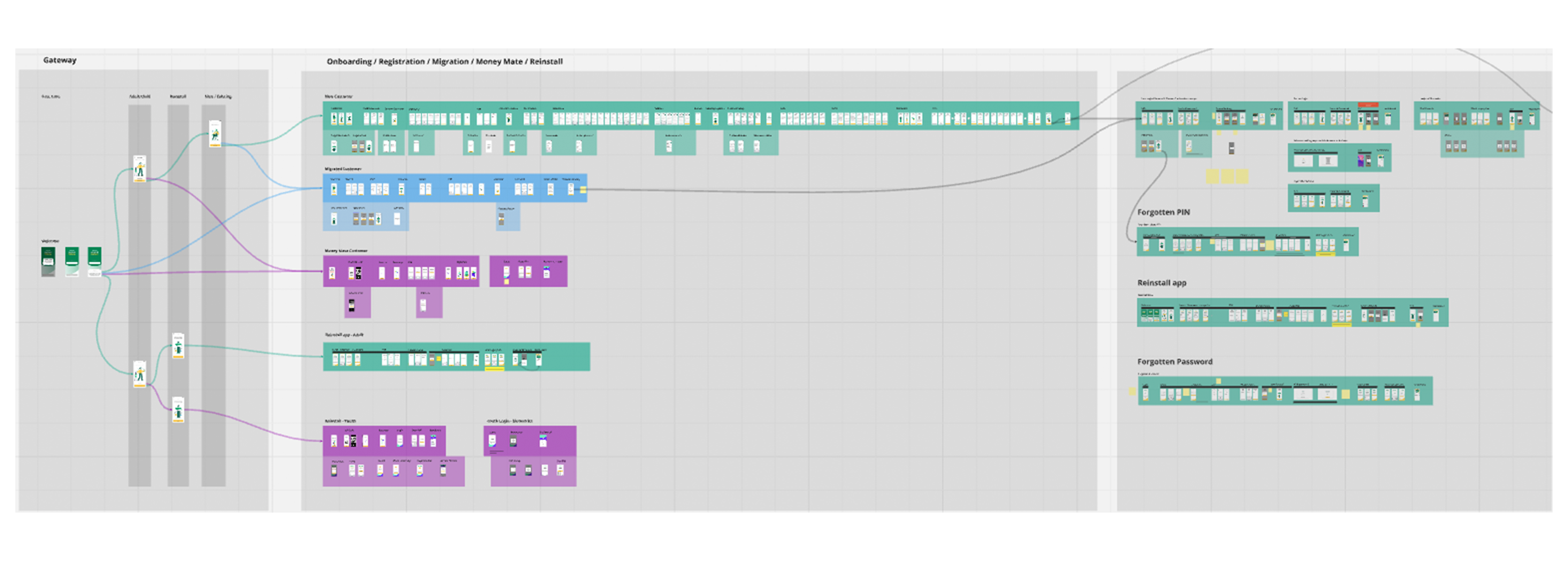
Onboarding Journeys & Information Flows
A key element of the experience was designing a flexible onboarding flow that could adapt to different scenarios (new youth users, existing current account customers, parent-linked profiles). This required close collaboration between design, product, compliance, and engineering teams to ensure the experience was simple, compliant, and scalable.
Implementation
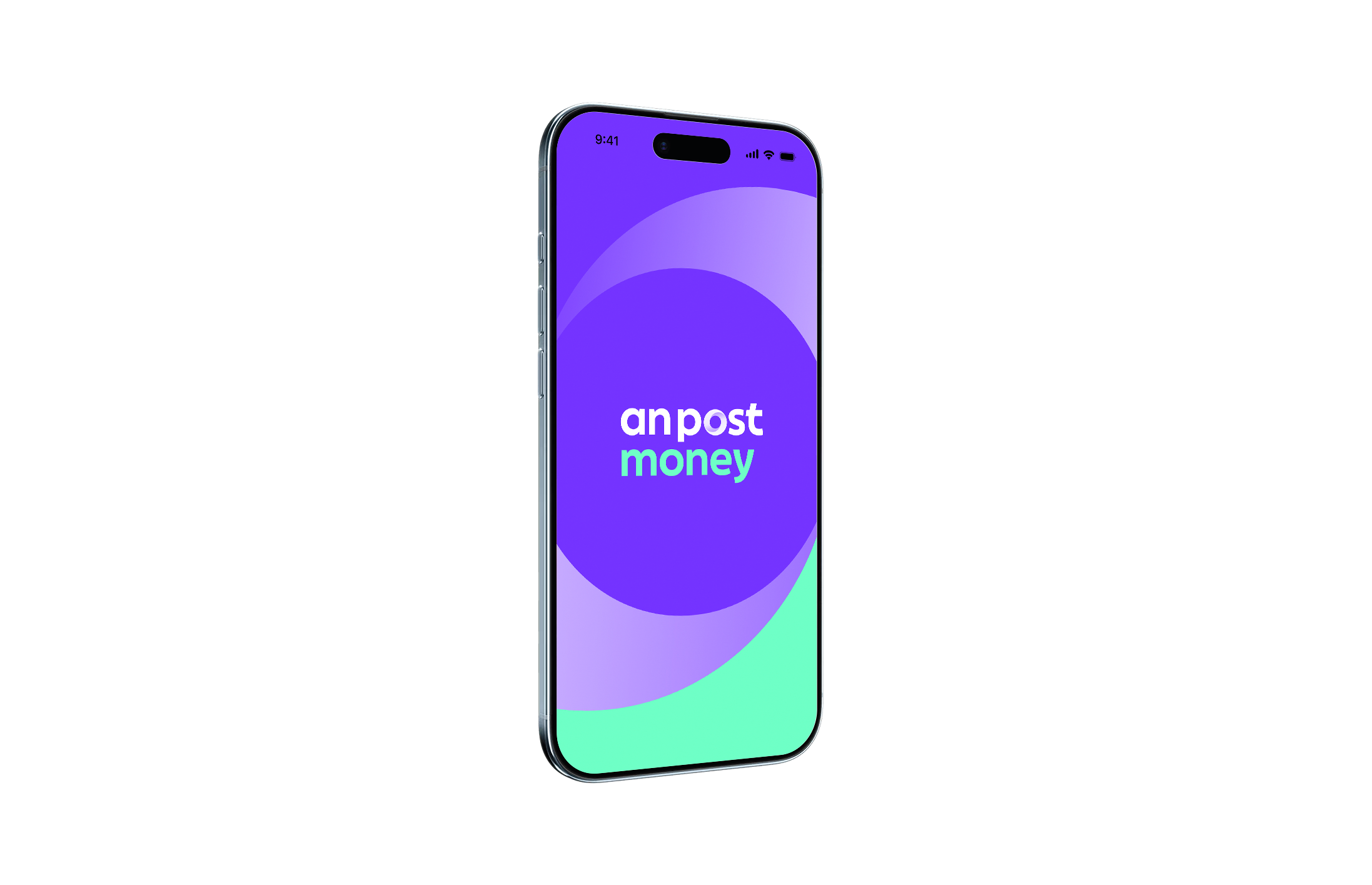
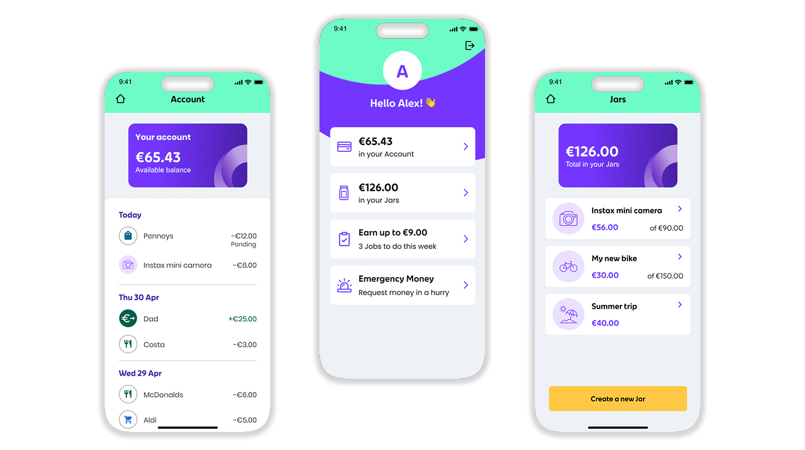
The final design system introduced a clean, modern visual style with optimistic colour choices, friendly iconography, and clear instructional guidance, tailored to both adult and youth audiences. We ensured:
Accessible UI patterns aligned with WCAG 2.0 AA standards.
Consistent component library for mobile and desktop delivery.
Modular onboarding flows supporting multiple account types and approval paths.
Clear parental oversight features to reinforce trust, transparency, and safety.
Regular design reviews and collaborative workshops with product and engineering ensured accurate implementation and reduced friction across delivery stages.
Conclusion
The project successfully positioned An Post to broaden its digital customer base and engage younger users at a formative stage in their financial journey. By combining research-driven insights with a carefully balanced visual and interaction strategy, we delivered an app experience that is engaging, responsible, and scalable, supporting both immediate product needs and future growth of the An Post Money proposition.