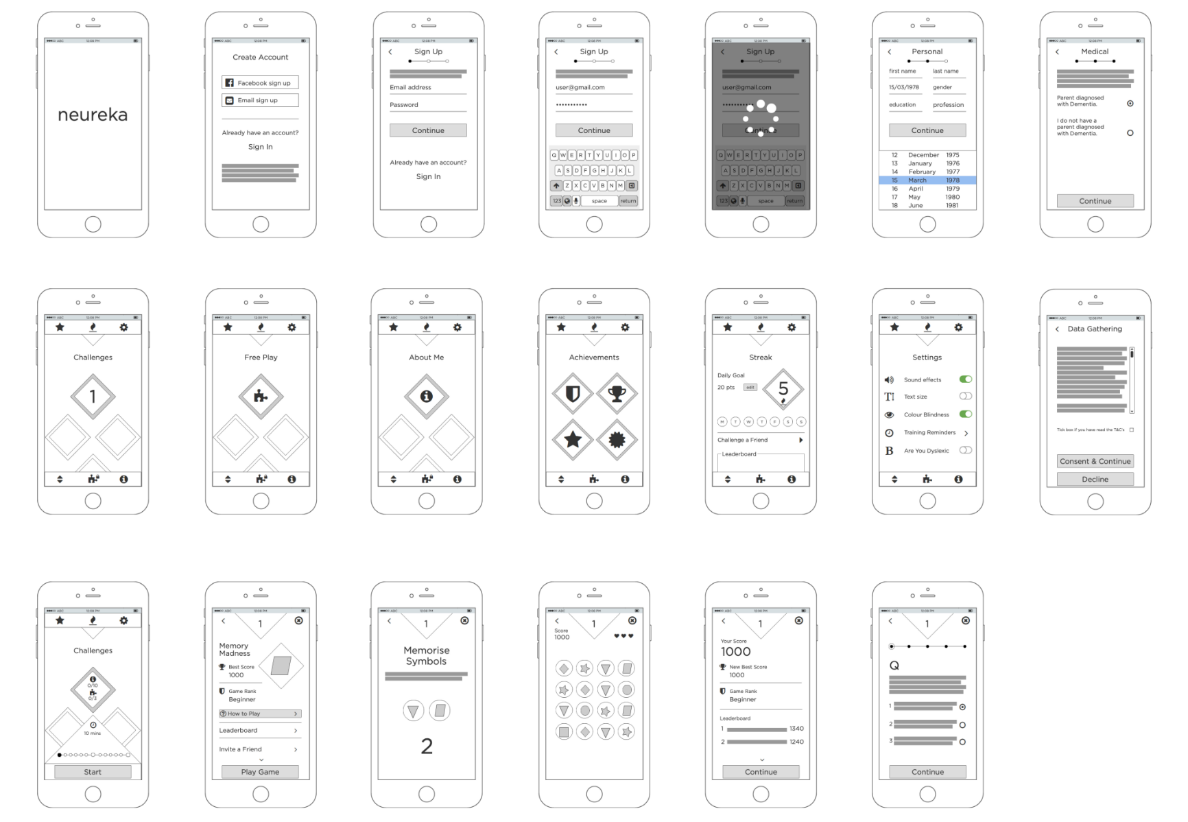
Scamps
It was essential to scamp down the user flow and to understand how we wanted user to engage with the app.
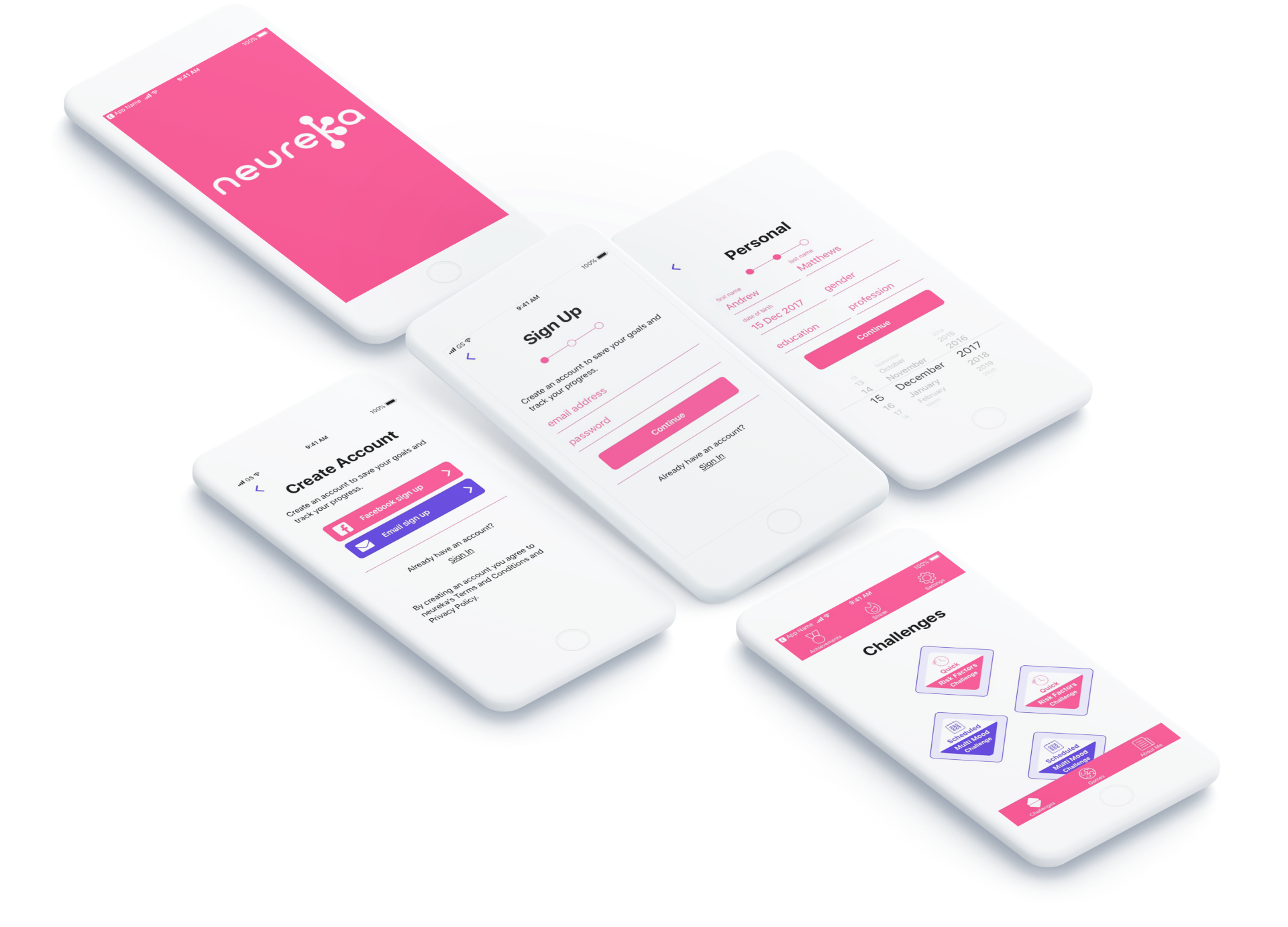
After visualising the login screens, it was key to create a landing screen that empowered the users to navigate the app as they so pleased.
The primary icons were housed in the top and bottom nav bars with the main screen containing the challenges that we wanted the users to engage with most frequently.
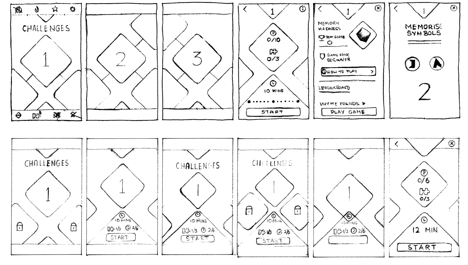
Wireframing
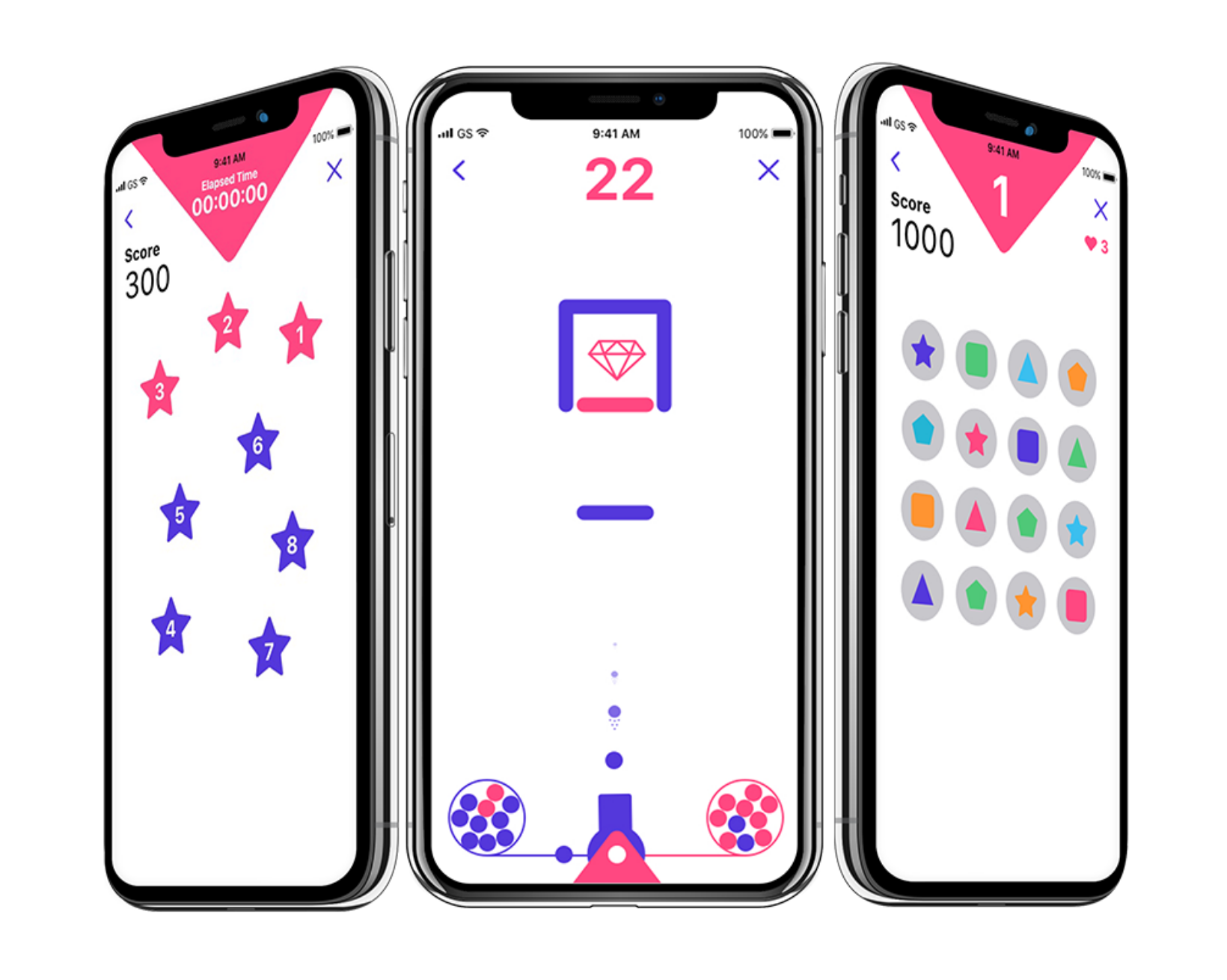
Wireframing the key screens threw up a few issues regarding the Challenges section, and how best to display users time involvement.
This was important as we were conscious of users levels of engagement and feared that a confusing messaging could deter them from progressing.
I focused on keeping it as simple as possible by reducing the options and ensured the messaging was honest and accurate.